|
|
Post by m on Nov 23, 2010 18:50:22 GMT -5
scraping the map, like maric just did is not a bad decision. it's very early in the competition, so if you don't have the right feeling for the map and have no real idea of how to magically put it back on track, then it's better to start fresh. anyway, here comes the feedback: feels a bit monotone. i know it's early on, but all textures and lighting doesn't differ too much. the player is not really guided or curious about certain spots or routes. i also have a hard time imagining this being a city. good brush and texture work. The second half of your comments are dead-on. The only unique "feeling" section of the map would be what's in the foreground of that screeny. The rest doesn't seem to work, it was too empty and meandering. I like to try and make maps that have a clear locus that draw players together. The other issue that backed me into a corner was making the "damaged" bits and pieces. It's freaking hard to pull that off decently in Q2. The only way I can imagine a salvage of the map would be to eliminate everything surrounding that central tower and in its background. If I do something like that I'll release this original version and what I come up with after the reconsideration. Or, I may just just move on. |
|
|
|
Post by Laura Hentschel on Nov 24, 2010 14:32:16 GMT -5
mmmmmmm i would add some trees yellow lights... blinking lights... the broken window of a shop.. broken newspapers in the floor.... dead bodies.. yeah! The Walking Dead!  Maybe I should be more explicit with the theme... But the theme is already released--- I only suggest some ideas hehe |
|
|
|
Post by Laura Hentschel on Nov 24, 2010 14:35:01 GMT -5
|
|
|
|
Post by Laura Hentschel on Nov 24, 2010 14:37:06 GMT -5
Maybe for other worlds theme some.. statues...  I saw robots in 2040rb.bsp |
|
|
|
Post by m on Nov 27, 2010 18:22:08 GMT -5
Ai'ght, I think I salvaged this thing. The question then is to bling or not to bling...eh? 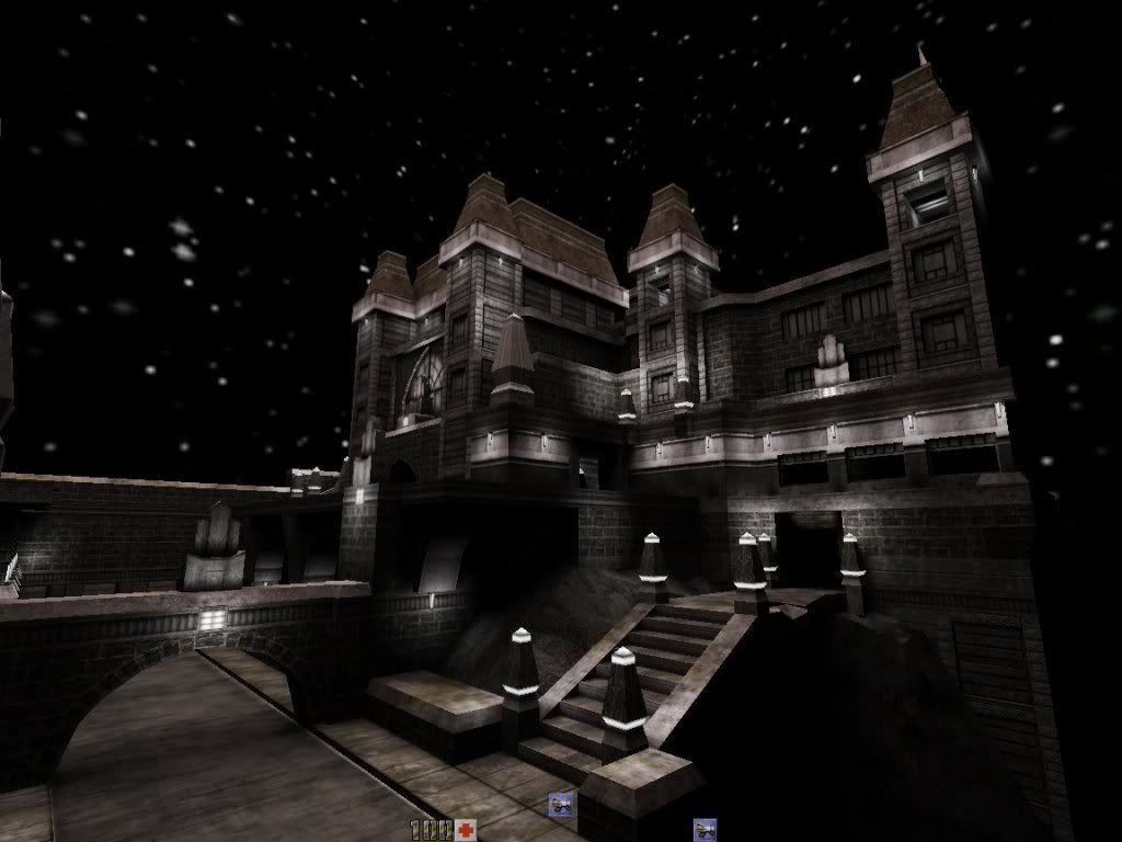 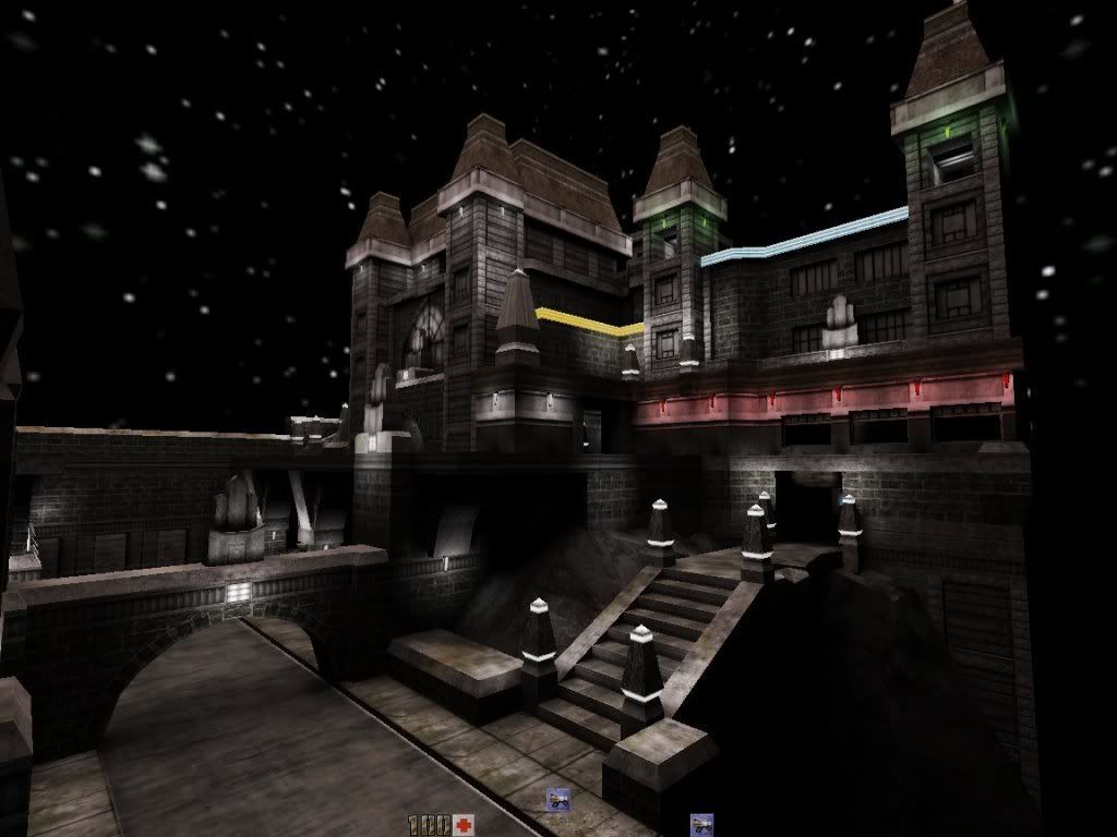 |
|
|
|
Post by spirit on Nov 28, 2010 8:55:24 GMT -5
The fist shot looks great, the 2nd looks like a failed attempt at christmas lighting imo. Don't throw away a map with such a great style! I want to see it published! (And don't mess it up with colored lights.)
|
|
|
|
Post by Laura Hentschel on Nov 28, 2010 13:28:27 GMT -5
the first is better x)
|
|
|
|
Post by m on Nov 30, 2010 11:47:17 GMT -5
I'm curious about how many surfaces you have in the map? How many brushes too?
You should be able to get away with quite a lot.
My one contest map has 2047 brushes with 11743 faces. One of my Awaken2 Assault maps (#5) has 3220 brushes with 18140 faces and then marics76 "And What Rough Beast" which was truly a beast to get finished and working properly has 3434 brushes with 19810 faces.
How does yours compare?
|
|
|
|
Post by Laura Hentschel on Nov 30, 2010 12:25:56 GMT -5
creepy sewer... = cool x) A zombie can get you there!! |
|
|
|
Post by spirit on Nov 30, 2010 13:27:00 GMT -5
If you use Radiant to build your map, simply click Misc > Map Info.
|
|
|
|
Post by spirit on Dec 1, 2010 3:55:44 GMT -5
Yes, I think Quark doesn't have the default map format because it saves information it needs for its special features (grouping etc) in the map file instead of using a 2nd file for that. I never used Quark but I think I once read that there was a way to convert from the Quark to the Radiant map format. But there really should be an easier way to figure out the number of brushes/surfaces in Quark, I doubt that you need to install Radiant for that...
|
|
|
|
Post by Laura Hentschel on Dec 2, 2010 18:12:30 GMT -5
Remove my questions,answers,map texture because i get only two responses..... ....i feel myself realy stupid.. Build a map for all Q2 players,take pictures put them online and all they do is read??.. ( Read 1,741 times). i know it,s a small group..but it,s important to give feedback. Sorry but why should i post info about my maps iff i get no feedback?. Good luck everybody with reading. ¡Is a very very very very small comunity! And some players dont know english and dont know what to post. Dont be angry!  |
|
|
|
Post by Laura Hentschel on Dec 2, 2010 18:26:30 GMT -5
As inspiration for Dark City theme...
A tip: "Dark City" is referring the atmosphere... The name of the theme does not mean that maps must represent a night scene by obligation.
|
|
|
|
Post by wixen1 on Dec 4, 2010 7:25:49 GMT -5
Cool sewer Margaal...  -W1 |
|
|
|
Post by m on Dec 4, 2010 11:13:45 GMT -5
A tip: "Dark City" is referring the atmosphere... The name of the theme does not mean that maps must represent a night scene by obligation. [glow=red,2,300]***I removed the pics in the quote to save some page loading***[/glow] 2066 brushes 13957 brush sides So, I hope this post is a good sign that all is well with this map and that we'll eventually see the finished version? The screenies look great. |
|